Welcome!
# Why use code?
We've learned lots of ways to tell stories with data that don't involve code. But making custom data visualization using code unlocks some cool things that you can't achieve otherwise.
Interactivity
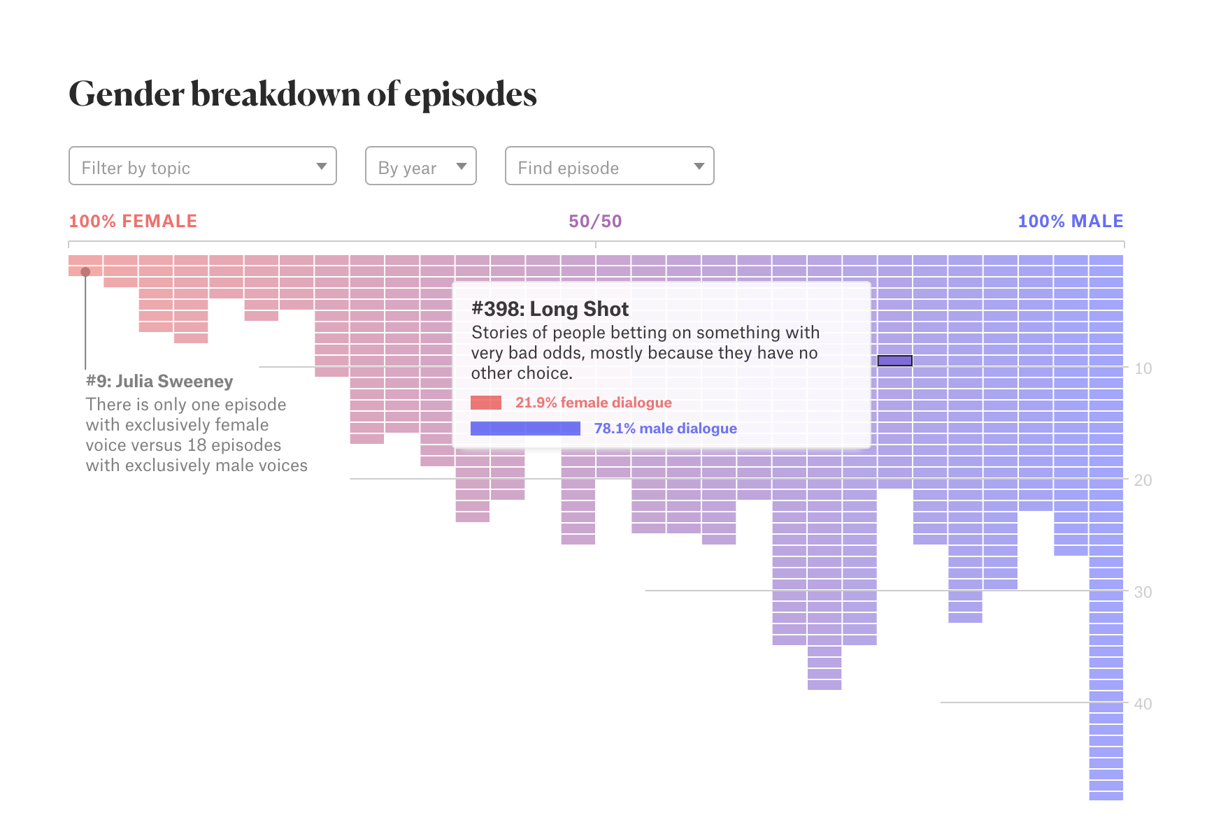
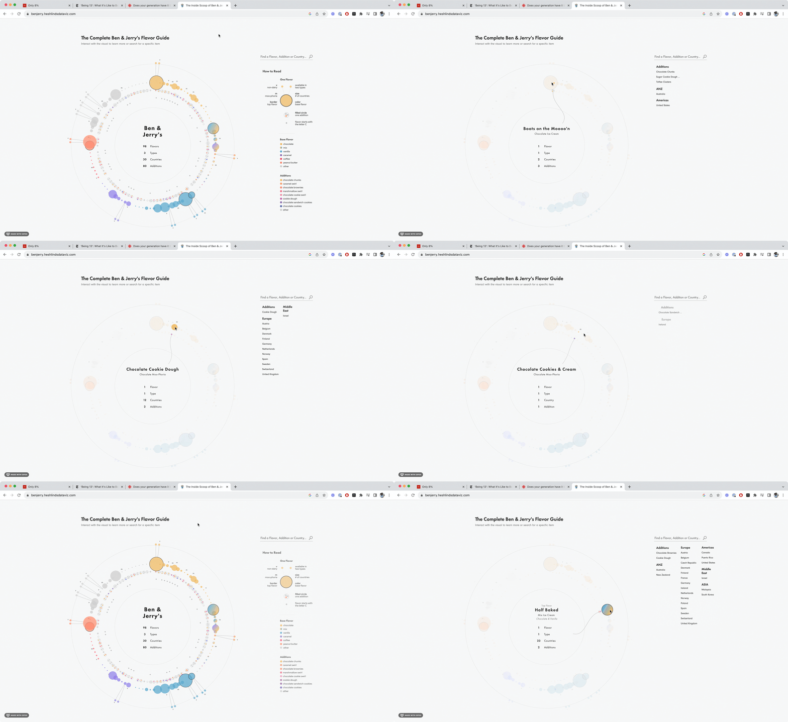
- If a reader wonders what the exact value of a data point is, they can hover over it and find out
 (Go to story)
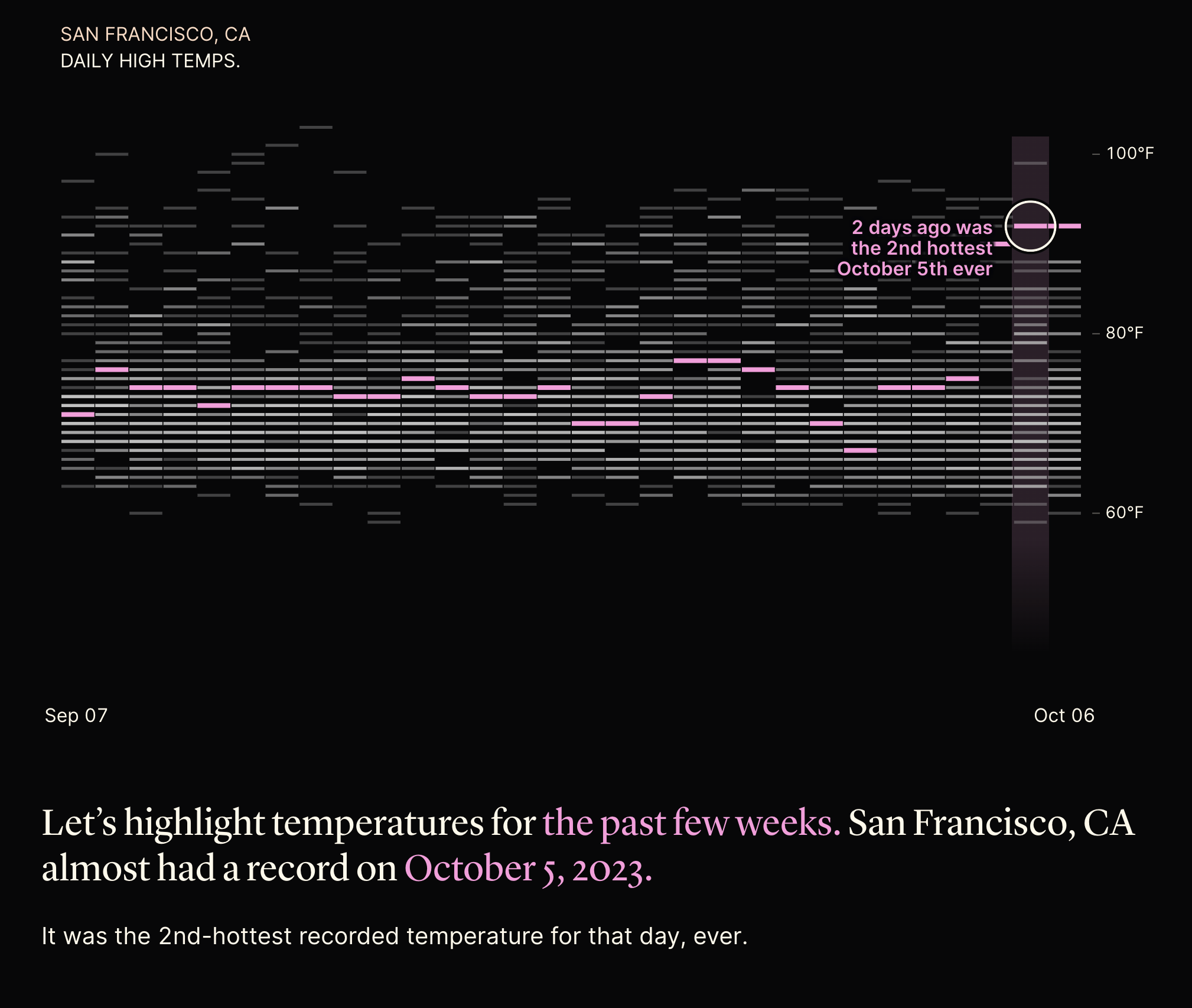
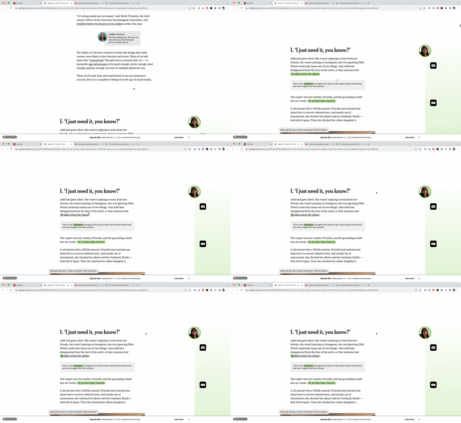
- We can tell a story with a chart, progressively revealing parts of it as the reader scrolls
 (Go to story)
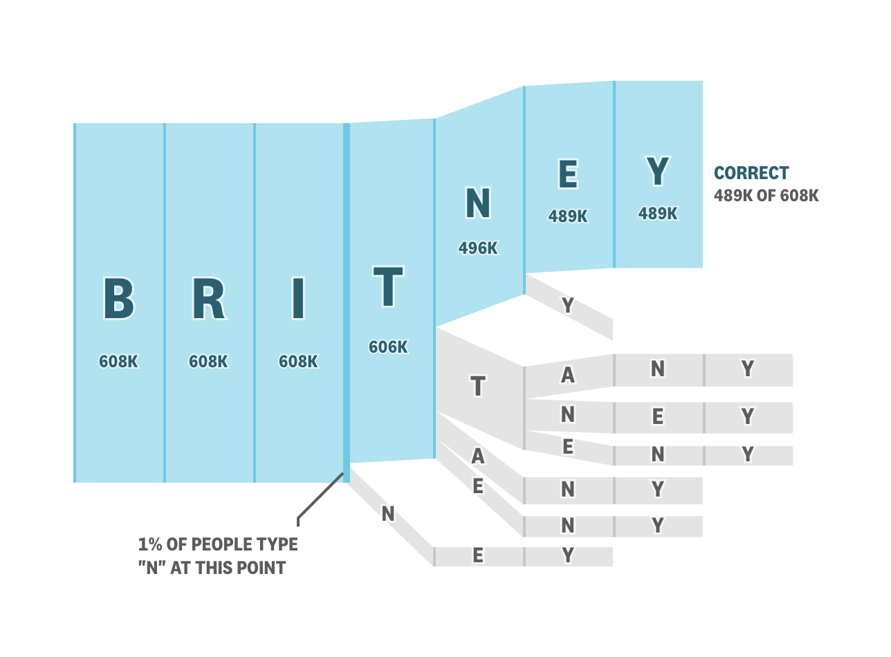
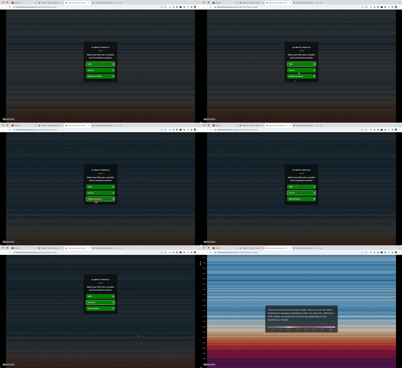
- We can use the reader’s input as part of the story
 (Go to story)
- We can give the reader tasks that help them learn concepts as they complete them
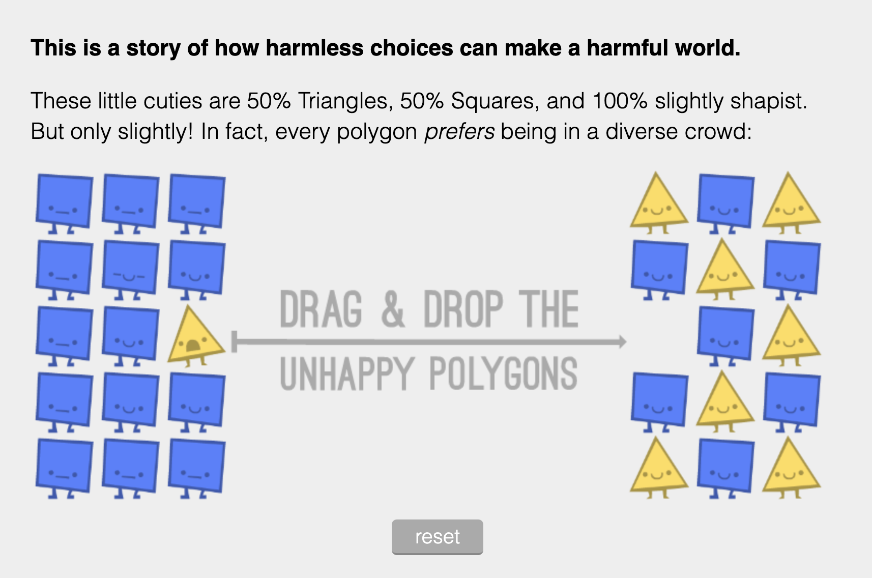 (Go to story)
Custom styling
- We can be very specific with visual touches (color palette, spacing, etc)
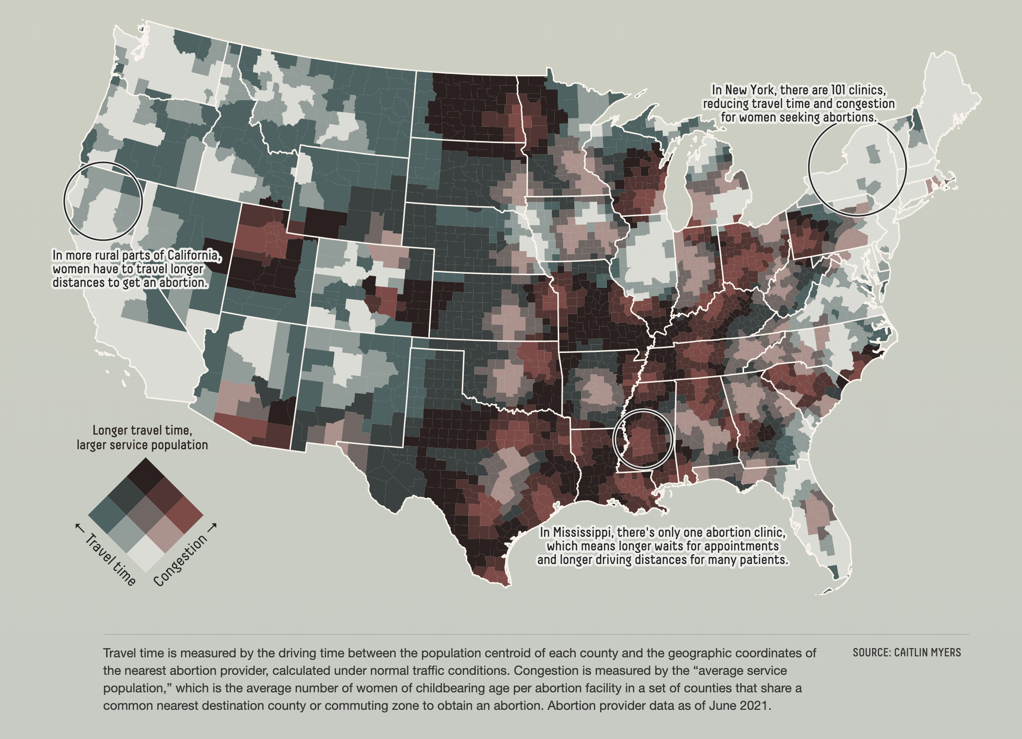 (Go to story)
- We can make charts outside of the traditional set of options
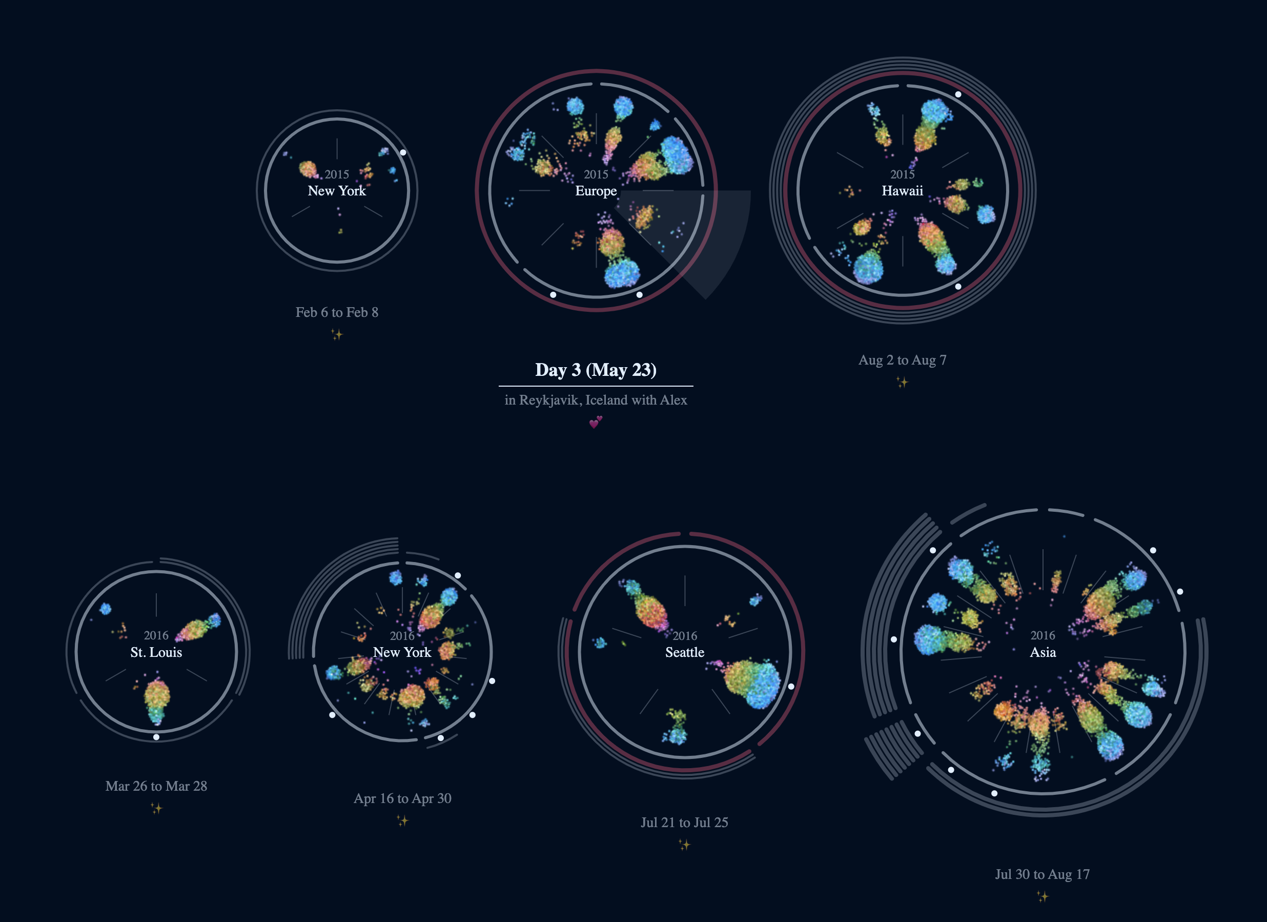 (Go to story)
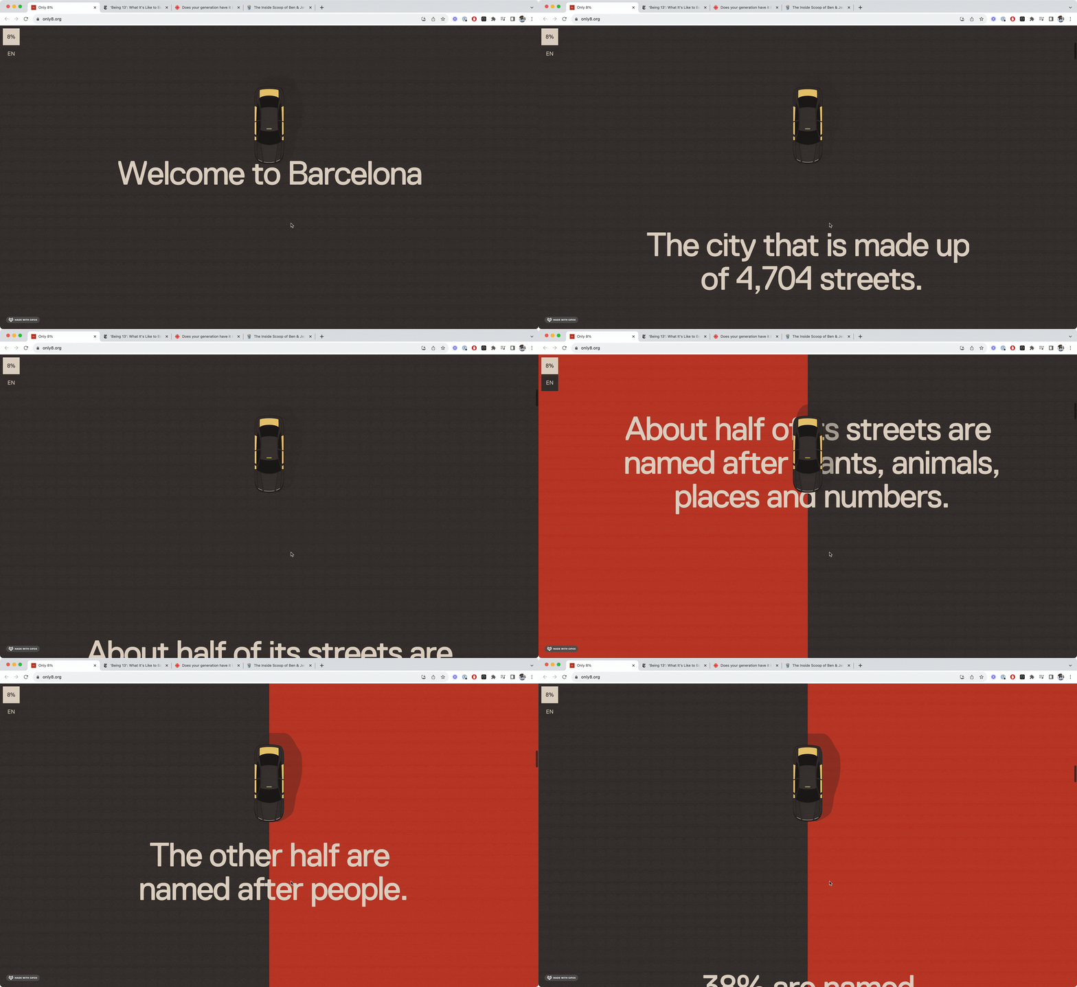
- Custom transitions and animations
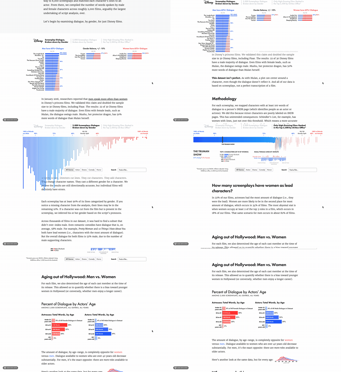 (Go to story)
At their core, these pieces are all webpages. So we need to learn a bit about how to make things on the web.
# The Big 3
There are 3 languages that make up the foundations of web development.
- 1. HTML 🏗️
- 2. CSS 🎨
- 3. JavaScript 🪄
You’re not going to master these today. The goal is to get a better sense of what’s going on under the hood. Let's go through each one.
# HTML 🏗️
HTML is for structure. It's like the blueprint for the website.
-
HTML consists of a series of elements stacked on top of each other.
# CSS 🎨
CSS is for style. It's how we make things look pretty.
-
This selects all paragraph elements and makes them red. Try adding 2 more paragraphs.
🏋️♀️ Exercise 🏋️♀️
Let's practice using HTML and CSS.
Save (cmd+s or ctrl+s) to fork this Sandbox.
# JavaScript 🪄
JavaScript is for interactivity. Any time the website needs to respond to what the user is doing, that's going to involve JavaScript.
 (Go to story)
 (Go to story)
 (Go to story)
 (Go to story)
Getting comfortable with JavaScript is a bit more challenging than getting comfortable with HTML and CSS. We'll dive into it more next class.
# An Example
Take a look at this piece.
Let's see if we can point out some ways that HTML, CSS, and JavaScript are being used.
- HTML - What types of elements do we see?
- CSS - Where is styling being applied?
- JavaScript - What are the ways the user interacts with the piece?
# Let's make a chart!
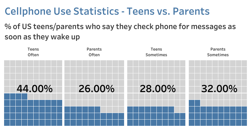
A waffle chart is used to represent percentages of parts of a whole. It's kind of like a square pie chart. We divide a square into smaller blocks that we can assign a color to.
-
We need to make 100 boxes. We can use
<div>s as our boxes. We will wrap everything in a<figure>tag, which is typically used for charts. Add a<div>inside the<figure>. Then, give it a width, height, and color!
# Homework
2 things to do before next class:
- Follow along with this video
to complete the exercise below on building a bar chart. Post the link to
your forked Sandbox to Latte.
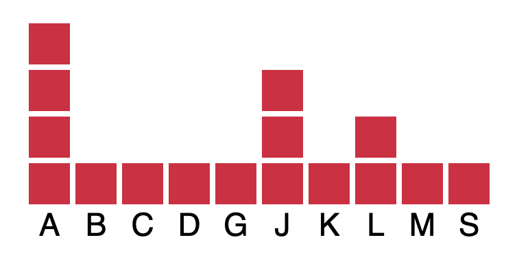
🏋️♀️ Exercise 🏋️♀️
Making a bar chart. We'll walk through it together!
Open SandboxSave (
cmd+sorctrl+s) to fork this Sandbox. - Find an interactive piece that you like. Tell us why you like the piece and how it's using HTML, CSS, and JavaScript.
